


Overview
After observing patients in a physician’s office, I decided to design an app that focuses on wait time, which comprises a large part of each visit and introduces a significant amount of pain points. Issues related to wait time and other in-office experiences were further explored via user interviews.
From this information I derived key features of app, entitled MedConcierge. MedConcierge keeps patients informed about their estimated wait times and lets them know what exactly they are waiting for. It also allows providers to communicate directly to patients about unexpected delays. Based on user desire for an app that addressed the time before and after the visit, features such as scheduling, communicating with providers about care, viewing visit summaries, and educational material about diagnosed conditions were ideated upon and ultimately included in the finished product. The result is an application that thoroughly considers and addresses patient care before, during, and after the visit.
Role and Scope
This was an individual project for a digital product design course. The user base was small (two participants) due to the time constraints imposed by the semester. This was an agile design process and the UX continued to inform the UI as user information was gathered and synthesized. This was a 6 week long project (September–October 2020) that concluded with presentation of a high fidelity prototype.
Tools
Miro, Otter.ai, Figma
Note: Click to enlarge images. Full sized images are available upon request.
Research
The research process began with an in-person observation of the process of attending a doctor’s appointment. I mapped out the process and noted potential error paths. Next, I conducted user interviews to identify individual pain points within this process and gather information about user needs, values, and motivations. I then analyzed existing apps (including MyChart, ZocDoc, and Sesame to gain a better understanding of what these apps offered and untapped opportunities. All of the information gathered was imperative in informing the generative process.
Service Experience Map
Individuals were observed in common areas such as the waiting room. Because I was an informal observer, I did not have the opportunity to accompany individuals into exam rooms or observe visits. For this reason, I based the touchpoints in the exam room experience on my prior professional knowledge of typical medical office workflows. Though direct patient observation would have been the most objective, it was not possible given the scope and circumstances of this particular project.
User Interviews
User interviews were conducted with two individuals, ages 27 and 59. Both met inclusionary criteria which consisted of 2+ doctor’s appointments a year and regular use of mobile applications. Given the small sample size, methods of research visualization and synthesis such as affinity and empathy mapping were bypassed.
Key Insights:
Patients often don’t understand the steps they must go through in the provider’s office (i.e., being brought to an exam room, waiting for the provider, waiting for labs, administrative tasks)
Patients associate long wait times without explanation with being non-valued or non-respected by provider
Oftentimes, patients are given a lot of information during a visit and struggle to remember it
Patients may want to learn more about their conditions but don’t know where to look
“[I’d like it if] the office could [let] you know ahead of time, before you even get there, if [the provider] is running late. To me that once I'm there I'm there. But let's say I could have run errands before I got to the doctor's office, if they knew [in advance] they [were] running 20 minutes late.”
“[Providers are] throwing a lot of information [at you] that you mostly don’t understand. So I think an after visit summary [would be] a great way to break it down for the patient. It's also something to refer back to.”
User Persona
A user persona was generated based upon information gleaned from user interviews. The persona was felt to fairly and equally represent both interviewees.

Generating Solutions:
Based on the information gathered, I was able to identify some concrete pain points, understand unmet needs, and devise some features that could improve my users’ experiences at the doctor’s office.
Problem Statement:
Although there are several apps geared towards scheduling doctors appointments and/or viewing visit summaries, none address the multiple wait times that occur throughout the course of the patient’s office visit (i.e., waiting in line to check in, waiting to be seen by the provider, waiting to have labs taken).
Various wait times throughout the course of a typical doctor’s appointment are often sources of patient frustration and confusion (i.e., fear of being “forgotten” about, uncertainty as to what will happen next during the visit).
Value Proposition:
An application that, when activated upon check-in, keeps patients informed in real-time about each step of their care and the expected wait time. The application will also allow communication with providers via a messaging platform so that providers can reach out in case of delays, which will keep patients informed while building rapport and conveying respect for patient time.
The application will offer features found across other medical apps, such as the ability to schedule a visit, send messages to providers to ask follow-up questions, and view post visit-summaries with information about diagnoses. The addition of these features will make this application a truly all-in-one experience.
Core Functionalities:
View realtime information about wait time and visit status
Receive messages from provider regarding delays
View visit summaries detailing exam findings, plan, and diagnoses
Schedule an appointment with a new or existing provider
Ability to message with provider about everything from delays to follow-up information
Task Flows:
Wireframes:
To the greatest extent possible, the app attempts to minimize visual and cognitive overload by utilizing progressive disclosure. This was carefully balanced with the idea of minimizing clicks and the end result attempts to strike a happy medium. The app’s design offers an alternative to other medical apps that tend to appear cluttered, resulting in increased time and frustration when finding the desired functionality. The result is an app that is usable and intuitive.
Main
Appointments Main
Provider Messaging
Upcoming Appointments
Wait Time: Check-in
Past Visit Summaries
Wait Time: Vitals
Find a Provider
Visual Design
The visual design is clean, modern, and minimal. The blues and greens evoke the notion of healthcare, while the coral accent and occasional illustrations make the app feel more approachable and less clinical. The minimalism and generous negative space is in keeping with contemporary expectations of luxury (which one might expect from a “concierge”) while simultaneously allowing for clarity of information. The interface is similar to Apple’s UI, which adds a sense of familiarity and usability to the experience.

Main
The main screen highlights two of the app’s core functionalities (outside of the functionalities that occur in real time during a visit) in one place. These include viewing past visit summaries and a shortcut to making a new appointment. The home screen also reminds users of upcoming appointments and allows them to view more information or make changes. Finally, the notification indicator on the bottom navigation bar lets users know at a quick glance when they have an unread message.

Messaging Feature
In addition to communicating about health-related matters, providers (or their office staff) can send messages to patients indicating delays. This messaging feature is quicker and less time consuming than a phone call, and the heads up makes the patient feel as though their time is valued and considered.
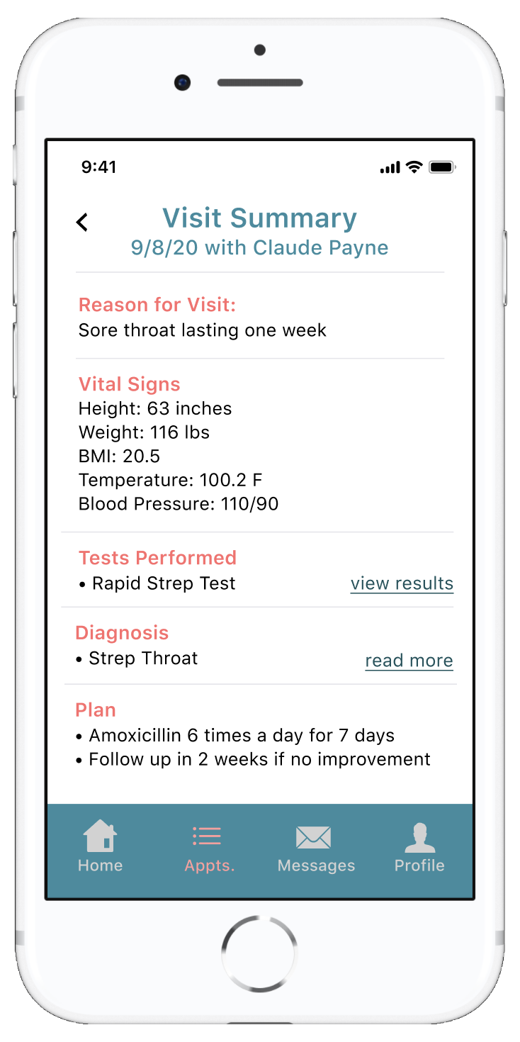
Visit Summary
After their visits, patients can review their diagnosis and treatment recommendations. From this screen, they can read about their conditions in greater detail and view test results. This summary helps patients feel like active participants in their healthcare and serves as a point of reference should they forget the specifics of what was discussed during the visit.

Provider Search
Patients can search for and book appointments with new providers across specialities within the app. This eliminates the need for a third-party booking application or website.

Login
The Login screen features a flat, minimalistic, illustrative design. The illustrations throughout the app exist to make it feel more contemporary and less clinical and intimidating.

In-Office Updates and Wait Times
Once patients check in, the wait time feature activates. By syncing with the patient’s electronic medical record, patients can stay informed throughout their visit and mitigate concerns of of being “forgotten about.”
Ideally, staff could check a box in the medical chart indicating what the patient is waiting for at any given time. AI algorithms would provide an estimated wait time based on the particular provider’s average time-based metrics.

Schedule an Appointment
Patients can easily schedule a new appointment past providers, or search for a new provider.
Interactive Prototype
The app was prototyped in Figma. Microinteractions are featured throughout the prototype to make the app more delightful and engaging for users.
Login
Messaging with a provider
Finding a new provider
Wait time feature
Viewing a visit summary
Usability Testing
Synchronous usability testing was conducted in person and remotely via video-conferencing. Across three participants, there were no misclicks. There was minimal lag time between clicks. All users indicated that they felt the app was simple and intuitive to navigate.
Outcomes and Conclusions
This product yielded valuable insight into patient perspectives related to outpatient healthcare in the digital era. As healthcare becomes an increasingly digital industry, it will be important to maintain humanism within the healthcare system. This case study illustrated several ways to accomplish this, perhaps most notably by keeping patients informed during the office visit. In the future, I hope to expand upon these insights and perhaps re-design this application with a larger user basis and greater opportunities for naturalistic observation. Through partnership with a healthcare system or electronic medical records, perhaps this application or a later iteration of it could be developed and integrated into our digital healthcare system.